CHI Madness Example Gallery
There are many ways to giving a great CHI madness presentation. To provide some inspiration, here are some presentations we saw at CHI 2006 and that we liked. Click on the pictures of the speakers to play a video of the actual presentation.
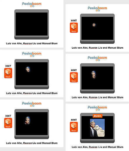 |
Get the Flash Player to see this video. Luis von Ahn, presented by Laura Dabbishwe liked:
involves the audience we also
liked: |
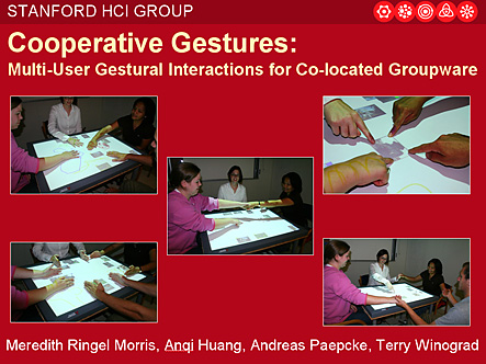 |
Get the Flash Player to see this player. Meredith Ringel Morris we liked: calm
presentation |
|
Get the Flash Player to see this player. |
Get the Flash Player to see this player. Steve Benford we liked:
wonderful teaser |
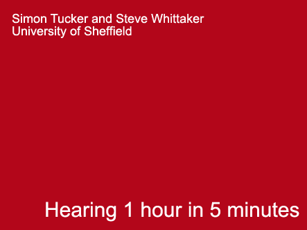 |
Get the Flash Player to see this player. Steve Whittaker
we liked: |
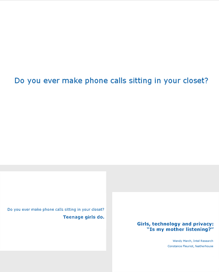 |
Get the Flash Player to see this player. Wendy March we liked: no images for a
non-visual topic |
Final tips: Leave out everything that is understood, such as "come to my talk" at the end of your presentation.
  |
Questions? Send email to Patrick and Gonzalo
at
chi2007-madness@acm.org
Created January 2007 by Patrick Baudisch and Gonzalo Ramos, Last updated January 2007 |